What You'll Learn
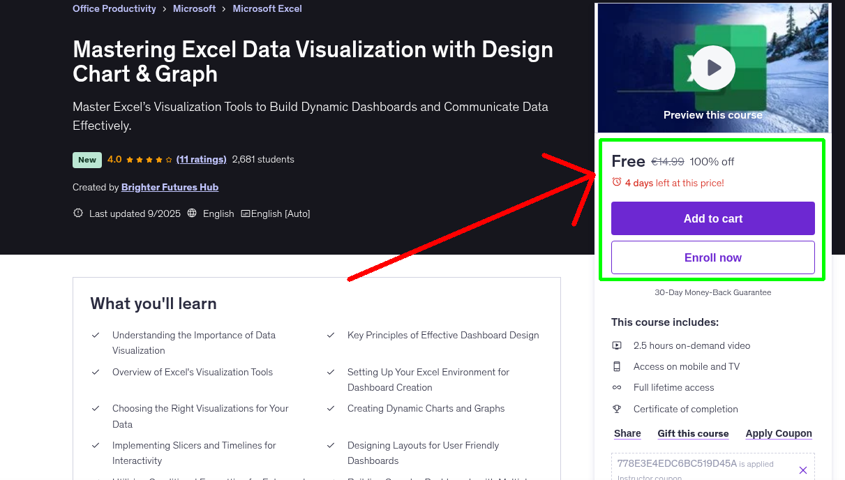
- Understanding the Importance of Data Visualization
- Key Principles of Effective Dashboard Design
- Overview of Excel's Visualization Tools
- Setting Up Your Excel Environment for Dashboard Creation
- Choosing the Right Visualizations for Your Data
- Creating Dynamic Charts and Graphs
- Implementing Slicers and Timelines for Interactivity
- Designing Layouts for User Friendly Dashboards
- Utilizing Conditional Formatting for Enhanced Visuals
- Building Complex Dashboards with Multiple Data Sources
- Optimizing Dashboards for Performance and more
Requirements
- No prior Excel experience needed.
Who This Course is For
- Anyone who wants to turn raw numbers into clear, persuasive charts
- Beginners who want to learn Excel charting from scratch
- Professionals who create business reports and dashboards
- Data analysts, finance experts, and marketers who need better visuals
Your Instructor
Brighter Futures Hub
Instructor at Udemy
4.0 Instructor Rating
466 Reviews
34,920 Students
32 Courses
Related Courses
More free Office Productivity courses you might be interested in
 Free 100% Off
Today
Expires in 3 days
Free 100% Off
Today
Expires in 3 days
Microsoft Word Essential Training: Master the Basics to Pro
Microsoft Word Essential Training Master the Basics to Pro for Business Professionals Formatting, E…
 Free 100% Off
Today
Expires in 3 days
Free 100% Off
Today
Expires in 3 days
Microsoft Office Mastery Learn Word Excel and PowerPoint
Learn Essential Office Skills: Create Stunning Documents, Analyze Data, and Deliver Impactful Prese…
 Free 100% Off
Today
Expires in 14 hours
Free 100% Off
Today
Expires in 14 hours
Mastering Power BI Report Design - Beginner to Advanced
A Full Guide to Creating Insightful Reports, Interactive Dashboards, and Effective Data Storytellin…
 Free 100% Off
14 November 2025
Expires in 1 day
Free 100% Off
14 November 2025
Expires in 1 day
The Leadership Accelerator
From stuck to seen: Your 90-day roadmap to clarity, confidence, and the promotion you deserve.
Never Miss a Coupon!
Subscribe to our newsletter to get daily updates on the latest free courses.